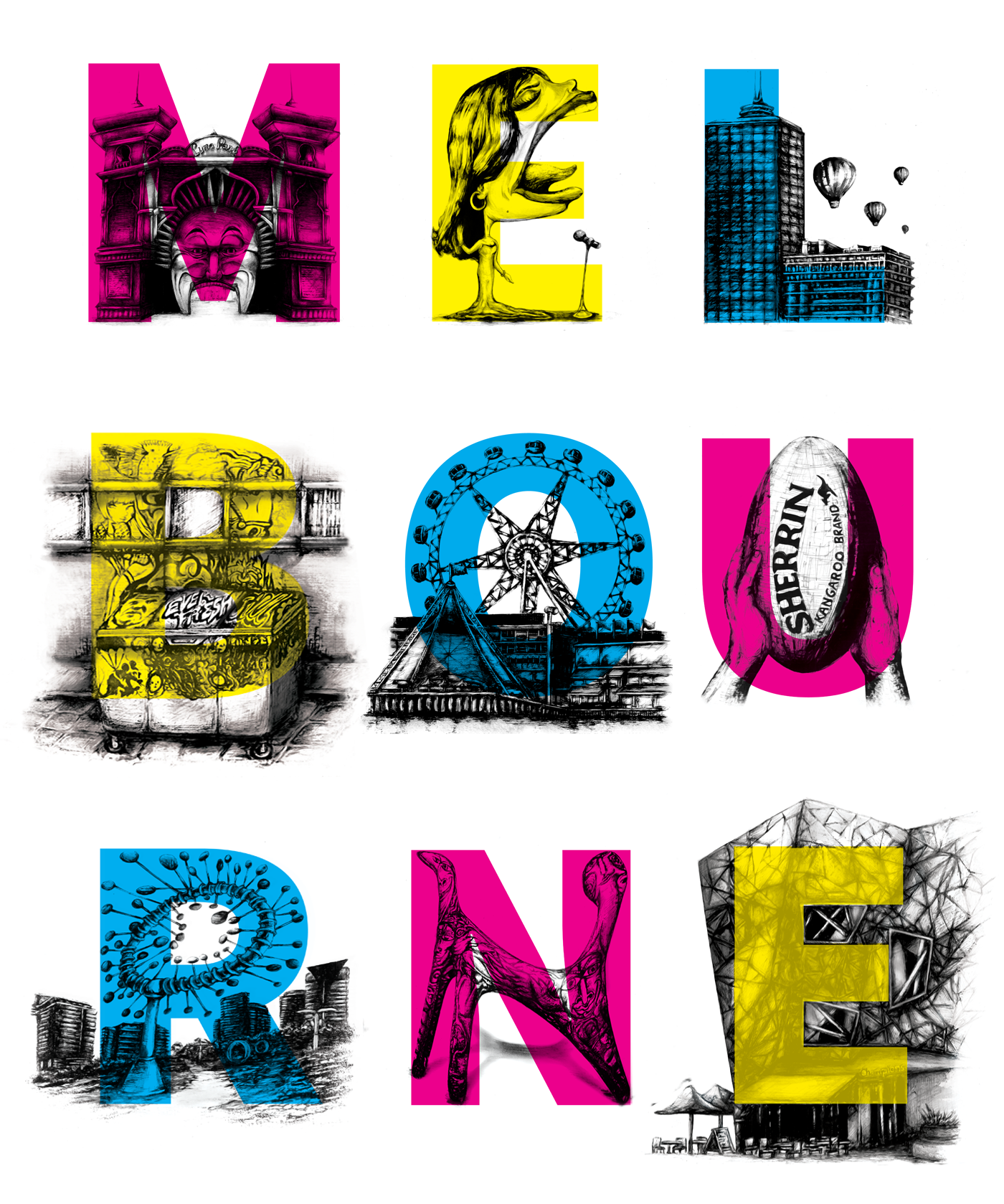
‘Sights of Melbourne City’ Pitch

Completed in 2014

In the early months of 2014, I was to explore and propose branding options for Mo Works Creative Agency. It was explained to me that the transition to a Melbourne office was a decision based on the owner’s love and appreciation for Melbourne as a cultural capital.

I felt this was an important value to visualize, particularly for local clients and audiences who feel similarly about their city. I liaised closely with members of the team and utilized some of the existing key branding elements, particularly the company’s CMYK color scheme. Undertaking research into what the common sights and attractions of Melbourne were, I combined my illustration abilities with simple typographic applications to create a link between well-known aspects of the CBD and the company’s appreciation for them.

Sketching

Development and initial sketches that took place.

'M' Gif
E
'L' Gif
'B' Gif
'O' Gif
'U' Gif
'R' Gif
'N' Gif
'E2' Gif
Lettersposter
OutcomePoster

Finished illustrations with typographic application. The final A2 framed print showcases the intended layout of the design overall.

ImageforFBComp
FBComputerImage

The social media concept, featuring the letters overlaid over the illustrations of Melbourne city’s sights and attractions (image sources: my own). The letter above, shown as examples, will be utilized on a platform such as Facebook each week. These regular updates contain a description of what each illustration reveals about Melbourne city’s cultural aspects, which helps promote the company’s appreciation for the CBD.

MoWorksShirt
Glassprint

Also depicted are the shirt and glass designs, which represent a more general distribution of merchandise that feature the design.